
Family entertainment centre branding has to work for two audiences at once: the children who want to go in and the adults who decide whether they will. Adventure Park is Emaar Entertainment's indoor family park at Dubai Hills Mall. This essay is about the one idea its identity rests on, and how that idea carries from the logo to everything else.
A park inside a mall
An indoor park has a problem an outdoor one doesn't. It sits inside a building that already has its own signs, its own colours and its own traffic. The park's brand has to be noticed from a walkway full of other shops, and then hold its own once a family is inside.
That means the identity can't be quiet. And a loud identity only works if the loudness means something.
Two audiences at once
A family venue is chosen by adults and judged by children, and the brand has to answer both. Children respond to energy and to something they can recognise from across a mall. Adults look for what they need to decide: where it is, when it is open, who it is for and whether it is worth the trip.
The identity carries the first job. The information carries the second, and it should be just as easy to find on a poster, a screen or a phone. A brand that only excites children, or only reassures parents, does half the work.
The letters are the ride
The idea is in the name itself. The letters are sketched, tilting and three-dimensional, so they read as if they are mid-bounce. Before a child can read the word, they can see what the place is for.
Putting the idea in the letters has a practical benefit. Wherever the name appears, the idea appears with it, and the logotype does the job on its own.
Colour that moves behind a mark that doesn't
The palette is bright, as a family park's should be, but it is not random. The two gradients are the sky and the lights against the ground and the go. The wave is the slide, and the mall's motion cutting through the photograph.
The mark stays the same; the colour behind it moves. That combination lets the brand feel lively on every poster and screen without the logo itself changing, which is what keeps it recognisable.
One device for every template
A family venue produces a lot of material: banners, social posts, stories, emails, signs for the next event. If each one is designed from scratch, the brand drifts.
At Adventure Park the templates for social posts and stories are built on the wave. Anyone producing a new post starts from the same device, so the hundredth post still looks like the first.
Guidelines that keep it consistent
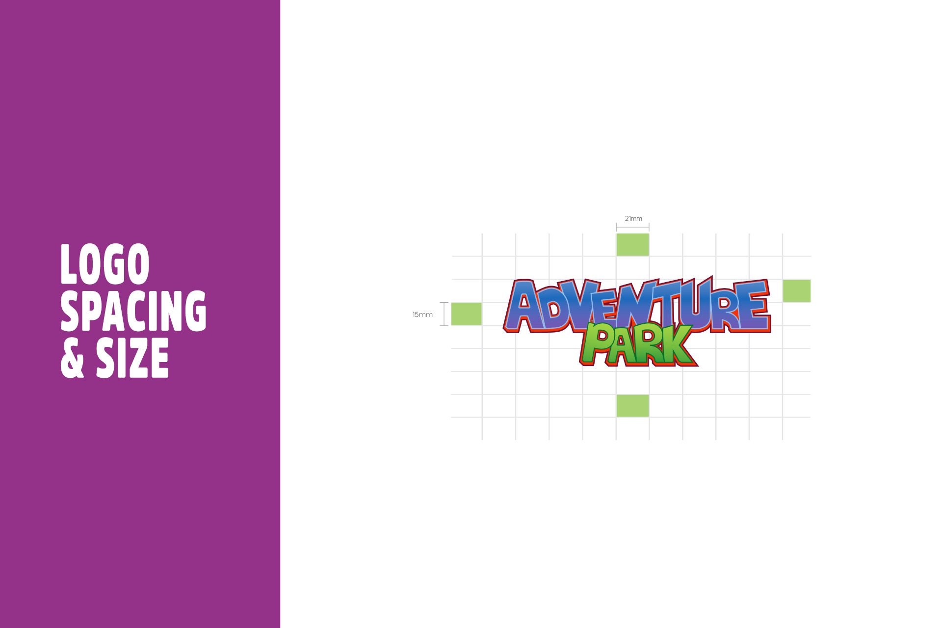
An identity this energetic needs firm rules, or it falls apart in other hands. The guidelines set the grids for print and digital, the templates and how the mark and the colours are used, so whoever applies it can work without guessing. The full delivery is listed on the case page.
From the billboard to the tub
The same idea carries from the "opening soon" billboard in the mall to the cup a child carries out. On the case page these are mock-ups, and the page says so.
What matters is that each of them would be recognisable with the name covered. The colour, the wave and the bounce do that work.
What carries over to any family venue
The specifics belong to Adventure Park, but four habits carry over to any family entertainment centre:
- Put one idea in the letters, so the name carries it everywhere.
- Let the colour move behind a mark that doesn't change.
- Build every template on one device, so new material stays on brand.
- Write guidelines that set the grids and the rules, not only the logo.
A branding project with us starts with one conversation about the place, who it is for and when it opens. See the full Adventure Park case.