
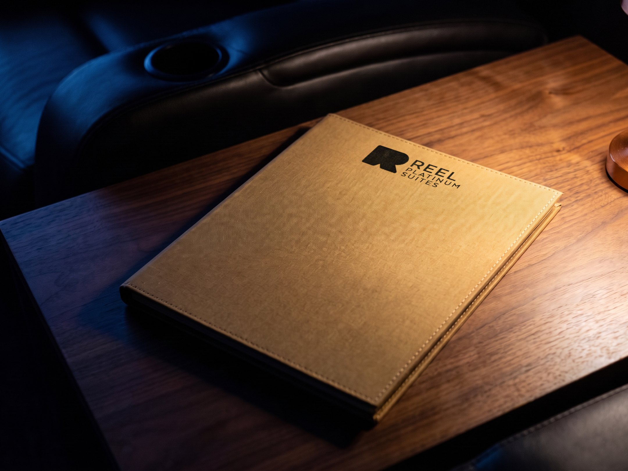
Restaurant menu design matters more than it seems. The menu is the piece a guest holds longest, so its type, its order and its paper carry more of the brand than the logo does. This note sets out how we approach a menu, from the list of dishes to the finished piece, with two of our own as examples: Lento, an all-day restaurant in Addis Ababa, and the Reel Platinum Suites at The Dubai Mall.
Start from the list, not the layout
Before any design, get the list right: the sections, the items, the descriptions, the prices and the languages. Many menu problems start here, with a list that grew one dish at a time and was never edited.
Keep the list in one file. That file then feeds both the printed menu and the menu on the phone, so the two never disagree. When a price changes, it changes once.
Order the menu the way the guest reads it
A guest scans a menu before they read it properly. The order should help them find their place fast:
- Segments first: breakfast, lunch, dinner, drinks, or whatever divides the day or the room.
- Then sections: within each segment, the groups a guest would expect.
- Then items: in an order that makes sense to the guest, not to the kitchen.
- Give each section the space it needs, and no more, so a section doesn't break across pages.
- Put the prices where they can be found, consistently, in the same place on every line.
Type that reads at the table
Menus are read in restaurant light, often dim, often at an angle. Choose type for that, not for the screen it was designed on.
At Lento, one typeface speaks first, for the section titles, and another does everything else. The text is printed in charcoal at full strength, never faded to look elegant, because a guest has to be able to read it. At the Reel Platinum Suites, the menu is read by the light of a table lamp, and the type is set for that light.
Arabic and English on one menu
If your guests read Arabic and English, plan both from the start: the list in each language, the order and the type, so neither looks like an afterthought. The Reel Platinum Suites menu is in English and Arabic.
The cover and the paper
The cover is the first thing a guest touches. Choose its material for the room and for how often it will be handled: a menu used all day needs to last, and one used for a special room can afford to feel special.
Design for the print run the menu will actually get. The finish, the paper and the colours that are approved should be the ones that arrive, so check them with the printer before the design is final. For the Reel Platinum Suites we redesigned the menu and produced it, which meant the design and the production were decided together.
Photographs, and when to leave them out
Photographs sell some dishes and crowd others. Use them where they help a guest choose, and leave them out where a description does the job.
If you shoot, shoot once for both uses: one set of photographs should serve the printed menu and the screen. On Lento's menu, a spread pairs a photograph on one side with a section on the other, so the picture never competes with the list.
The QR version
The menu behind a QR code should be a page that reads on a phone, not a PDF of the printed menu. When the same list feeds both, the QR menu is always current and easy to read with one thumb. Our note on restaurant branding shows how the menu fits into the rest of a restaurant's brand.
How a menu project runs with us
The fee is set by the scope: the number of pages, the languages, the cover materials, the photography and the print quantities. We quote after a short call, once those are known.
A menu project with us starts with one conversation about the place, the guest and the list. Read more about our restaurant branding in Dubai.