
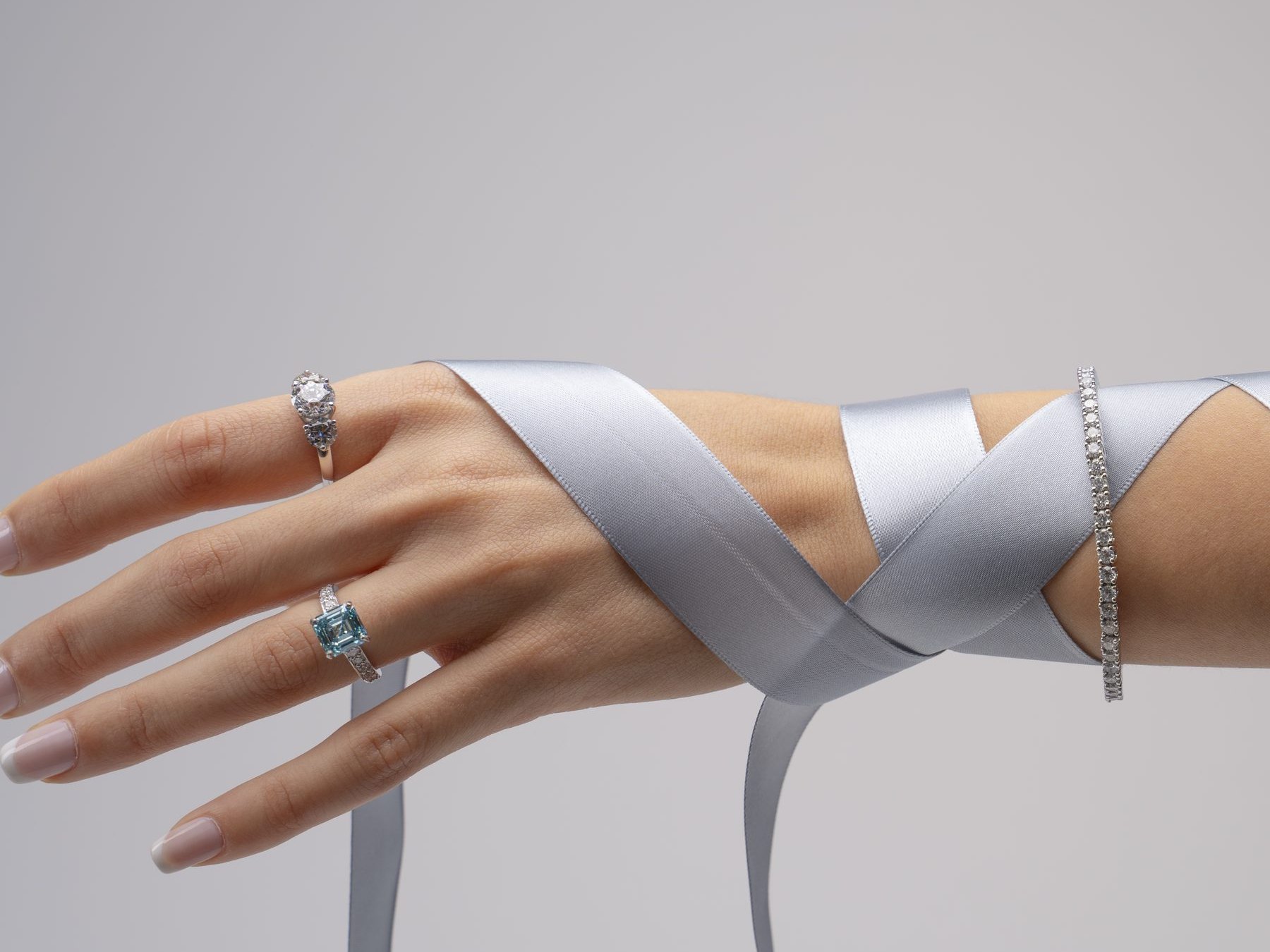
Jewellery branding is read at two distances. In the hand, the brand is a box, a ribbon and a tag. Across the street, it is a shopfront and a campaign. An identity has to hold at both, and for a jeweller the gap is wide, because the piece itself is small.Below are three identities from our studio in Dubai and the one idea each of them rests on.
What a jewellery brand identity covers
A jewellery identity is more than a logo. It usually covers:
- the wordmark, and any mark or ornament that goes with it;
- the colours, with the tints they can be printed in;
- the typefaces;
- the packaging and the ribbon;
- the small printed pieces: the tag, the care card and the certificate.
The last group is easy to leave out, and it is the part a customer keeps.
Draw it for the smallest piece first
We draw the mark, the palette and the type for the smallest applications first, the maker's mark inside a ring and the tag on a garment, and only then take them up to the shopfront and the campaign.
The order matters. A mark that holds at a few millimetres will survive being made large; a mark drawn for a billboard often falls apart on a tag. Starting small also keeps the identity honest about detail. A thin line that looks elegant on a screen can disappear in foil, so it is tested where it will actually be printed.
La Vie: a cut stone at the shoulder of the name
La Vie's identity rests on one gesture. The wordmark is drawn as a typeface of its own, and an ornament sits at its shoulder: a cut stone seen from above, in pale blue.
That ornament does what a separate logo would do, without leaving the name. It can sit on a ribbon, close a carrier bag or mark a box, and it always points back to the word beside it. The case page says which pictures are photographs and which are mock-ups.
Uzay: four letters and an open A
Uzay's wordmark is four capitals in a single line weight, with the A drawn open, without its bar. Everything else can be built from that.
The brand no longer trades, so its case page reworks the identity from the wordmark alone. The pattern, the posters, the tag and the card are drawn from the letters' own angles and weight. It shows how far one well-drawn word can carry a jewellery brand when the rest is built from it.
Whispers of Alara: from the strategy to the product page
Whispers of Alara is fine jewellery from the Arab world. Each collection starts from the region's architecture: Amara from the domes of Amman, Sinan from the Ottoman geometry of Mimar Sinan.
Here the identity came after the strategy. The strategy set who the jewellery is for and gave each channel one job: the website sells, social media tells the story. The logo in English and Arabic, the colours and the type followed from that, and so did the online store.
See the Whispers of Alara case
Colour comes from somewhere
In each of these identities the colour has a source. La Vie's ornament is pale blue. Uzay's colours are the ones its original applications carry. Whispers of Alara pairs charcoal and sand with burgundy and pale lavender.
A colour with a reason is easier to hold on to. When a supplier offers something close enough, or a new collection tempts a change, the reason is what keeps the brand from drifting.
Working with us on a jewellery brand
A jewellery buyer in Dubai meets the brand in the box, the boutique, the feed and the campaign. Our note on luxury branding covers how one brand holds across all four.
Should a jewellery logo work in Arabic and English? If the brand sells in the region, design both scripts from the start rather than adding the second one later. Whispers of Alara's logo is drawn in English and Arabic as one identity.
A jewellery project with us starts with one conversation about the collection, who buys it and where they meet it. Read more about our jewellery branding agency in Dubai.